Emigre 015
Without notes by
 Luke Dorny
on
next to the food truck on Bainbridge Island
and then saddled up.
Luke Dorny
on
next to the food truck on Bainbridge Island
and then saddled up.
Type Style.
When designing the latest iteration of this site, I knew from the start that it had to be a motif that recalled my past as it relates to digital design.
In this case, pulling in typefaces from one of my favorite design houses of those years was an easy choice. But which typefaces? Easy.
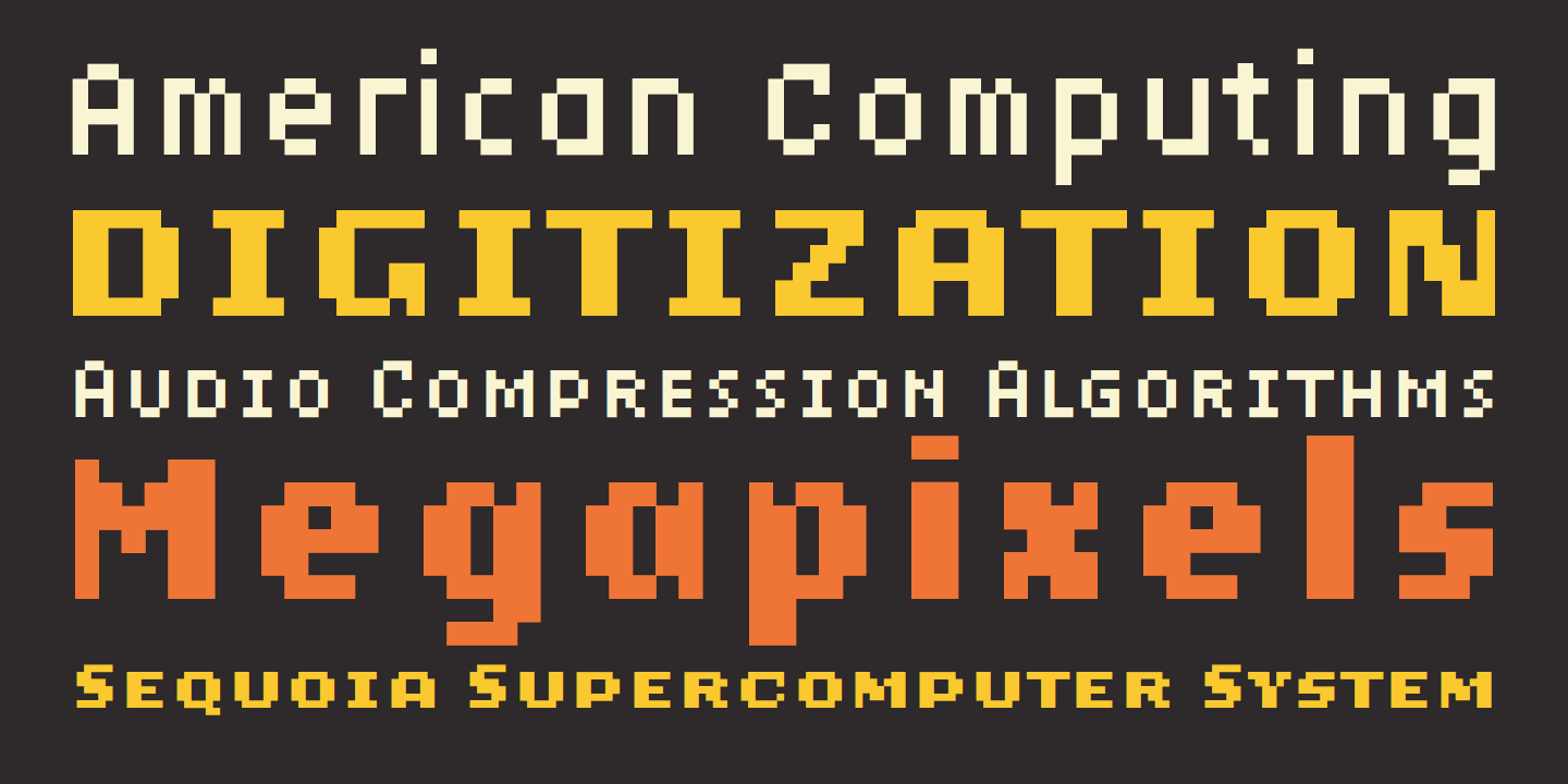
Lo-Res
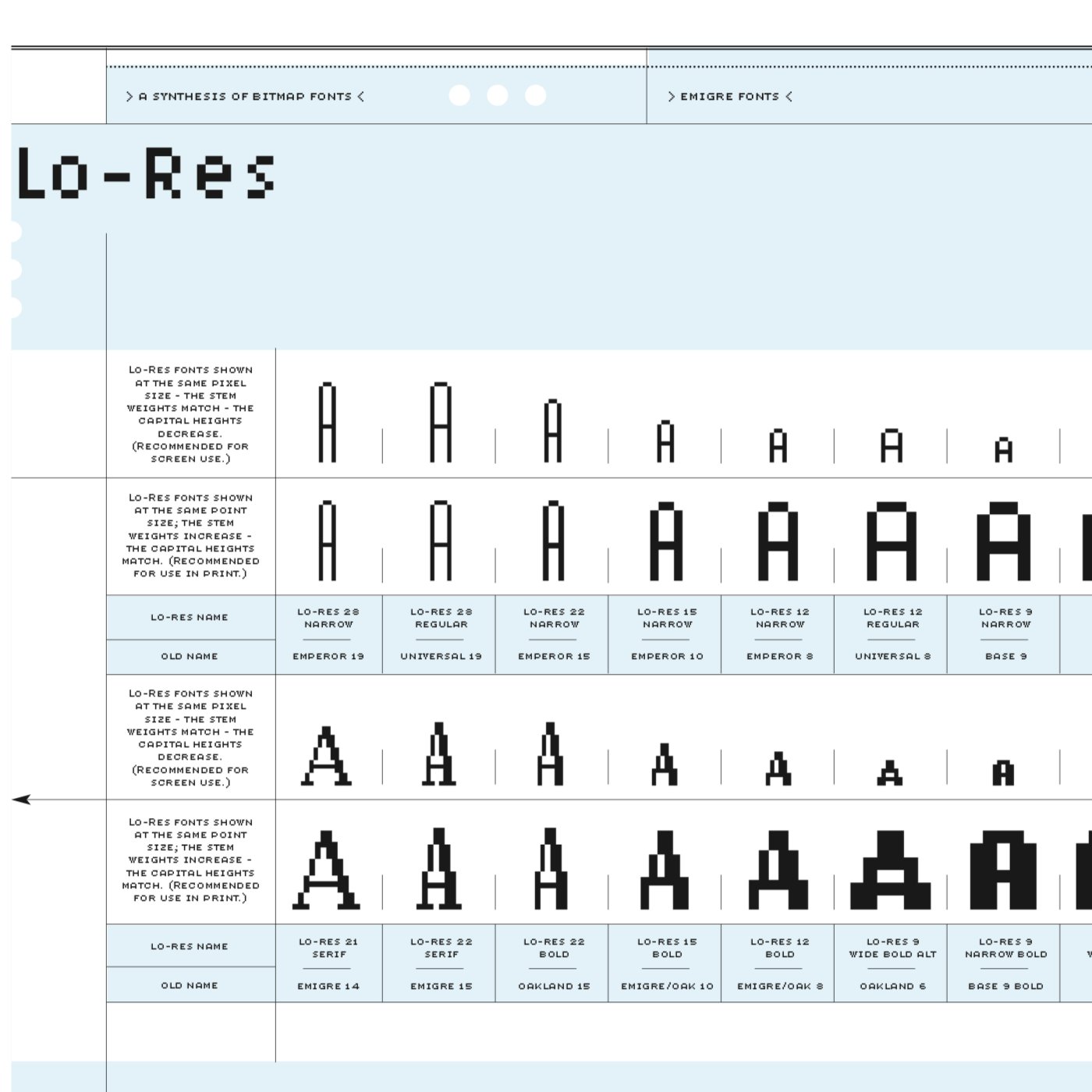
The Lo-Res type family hinted at a digital past that was stuck in an era of blocky bits and dot matrix printers. Design of the site came quickly after that, but it never really landed until I discovered the beauty of hi-fi devices created via CSS.
It took a while for the look of this design to firm up, so in order to arrive at a point where the design would be something worth presenting, I spent some time tinkering with alternate ideas, …hints of digital panels, physical buttons, art and interfaces with blocky 8-bit features, and electronic displays. I had filled my head with lots to reference and ended up having barrels of fun coming up with this.

There is a lot of this website that is pure design self-indulgence, but at this point, that’s all this site has ever been.
So this seems fitting.
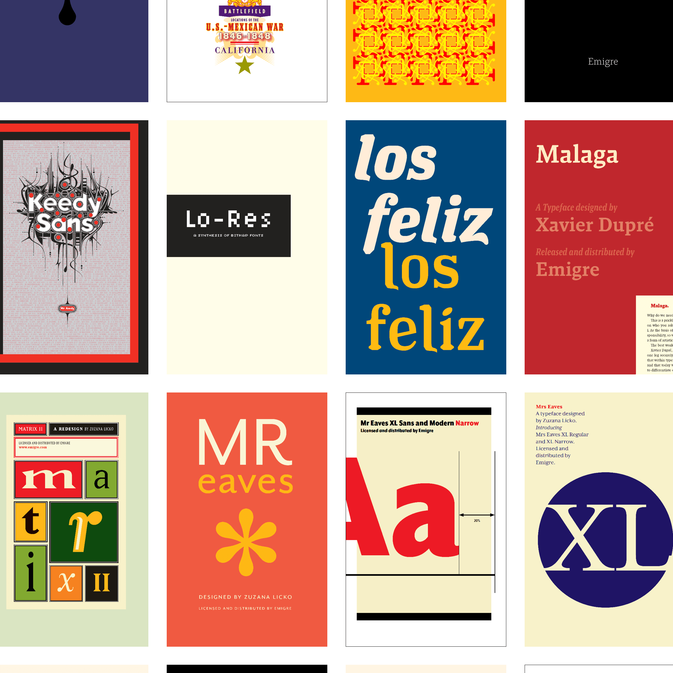
Emigre
Thank you, Zuzana Licko (for designed this typeface) with Rudy VanderLans and Tim Starback for your inspiring and powerful design. Thank you, Emigre, for the career-long inspiration via posters, type, music cassettes and CDs, and tshirt designs that were all part of my design life.
If you’d like to see some of Emigre’s work over the years in type design, a quick visit to the Type In Use site will be quite satisfying:
https://fontsinuse.com/foundry/28/emigre
The Letterform Archive contains all of Emigre’s print work, too:
http://letterformarchive.org/collections/#emigre
Like it? You can ☕️ Buy Me Cocoa.