< Articles

Farewell Version 6 032

Farewell, wildly entertaining audio-themed… theme!

I must admit designing version 6 of this blog was a massive boost to my creativity back in 2020.
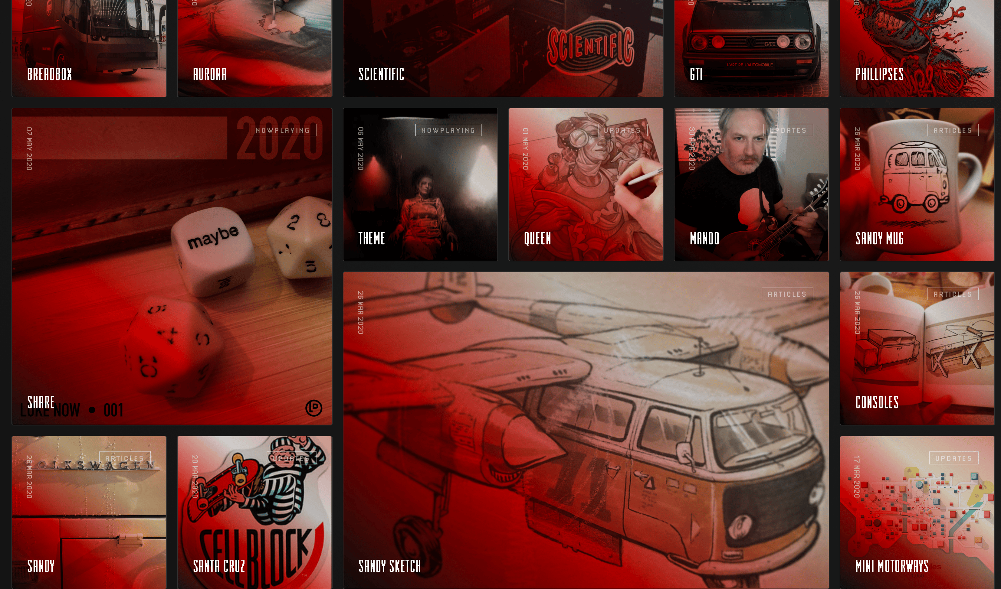
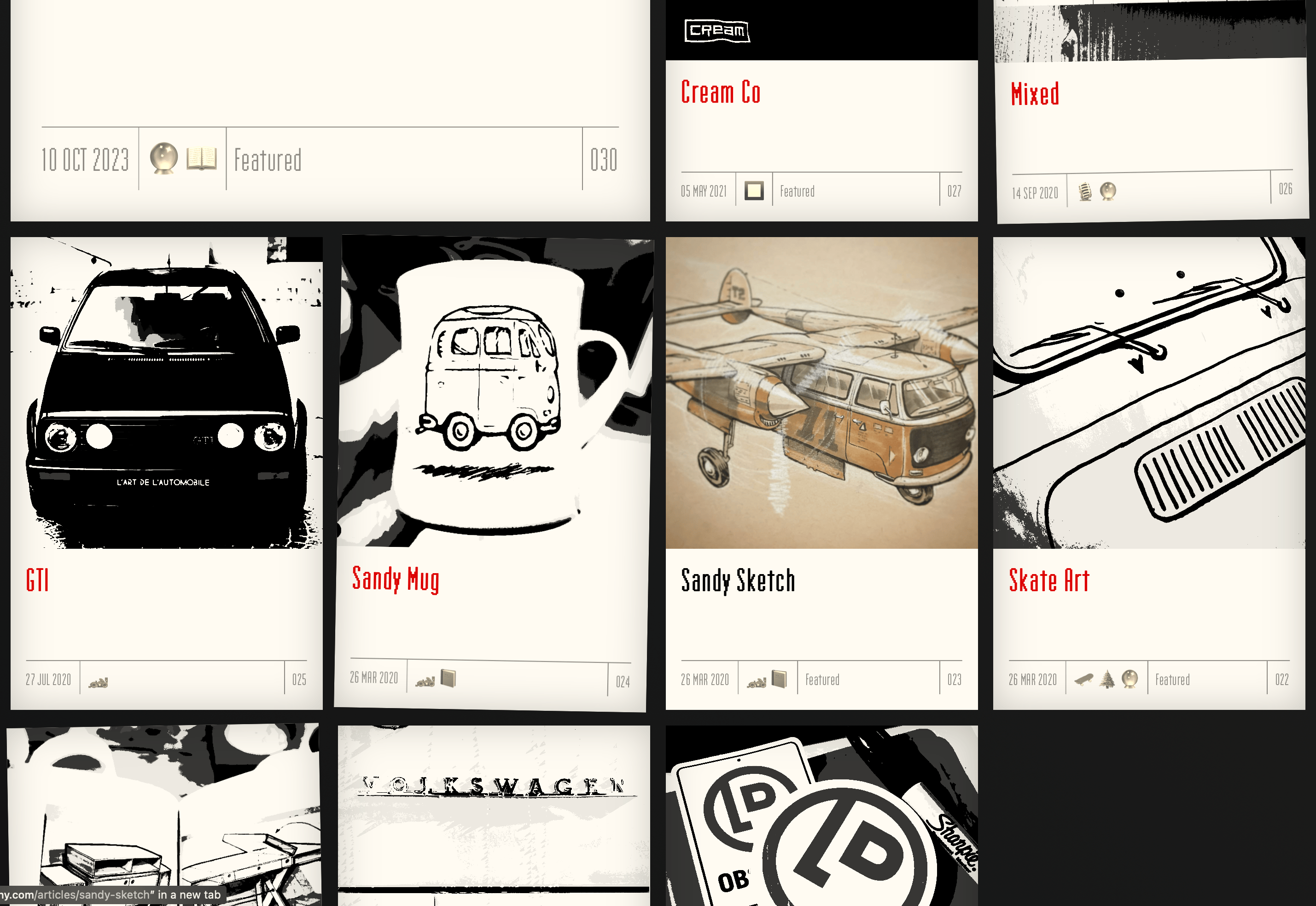
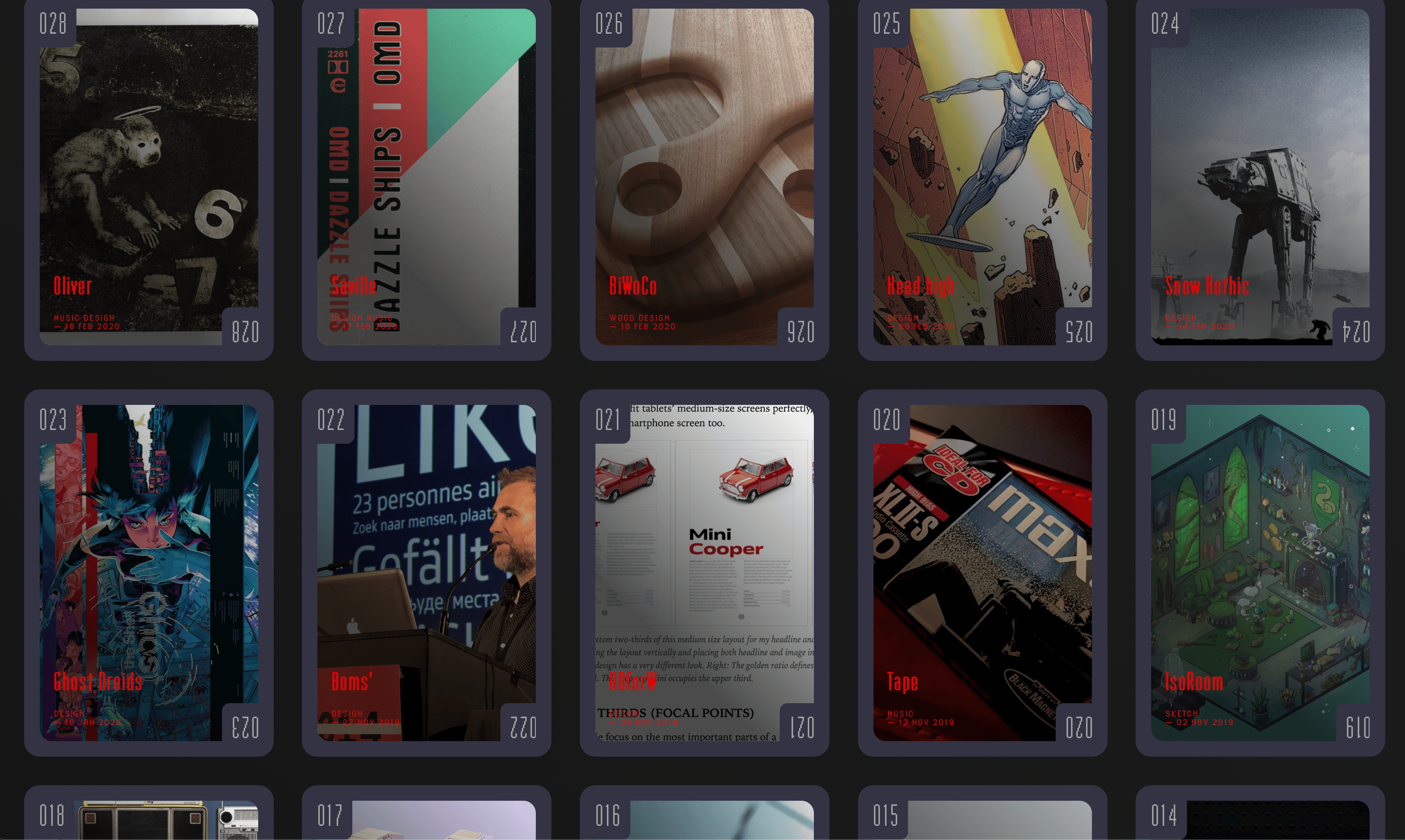
Let’s revisit some of the parts that made me smile. Finally a site design that really showed off some thematic design that, while incredibly unprofessional and very indulgent, scratched a major itch: A theme that crossed all over the site with a darkly-lit audio equipment vibe. I was here for it. And it was all coming together.
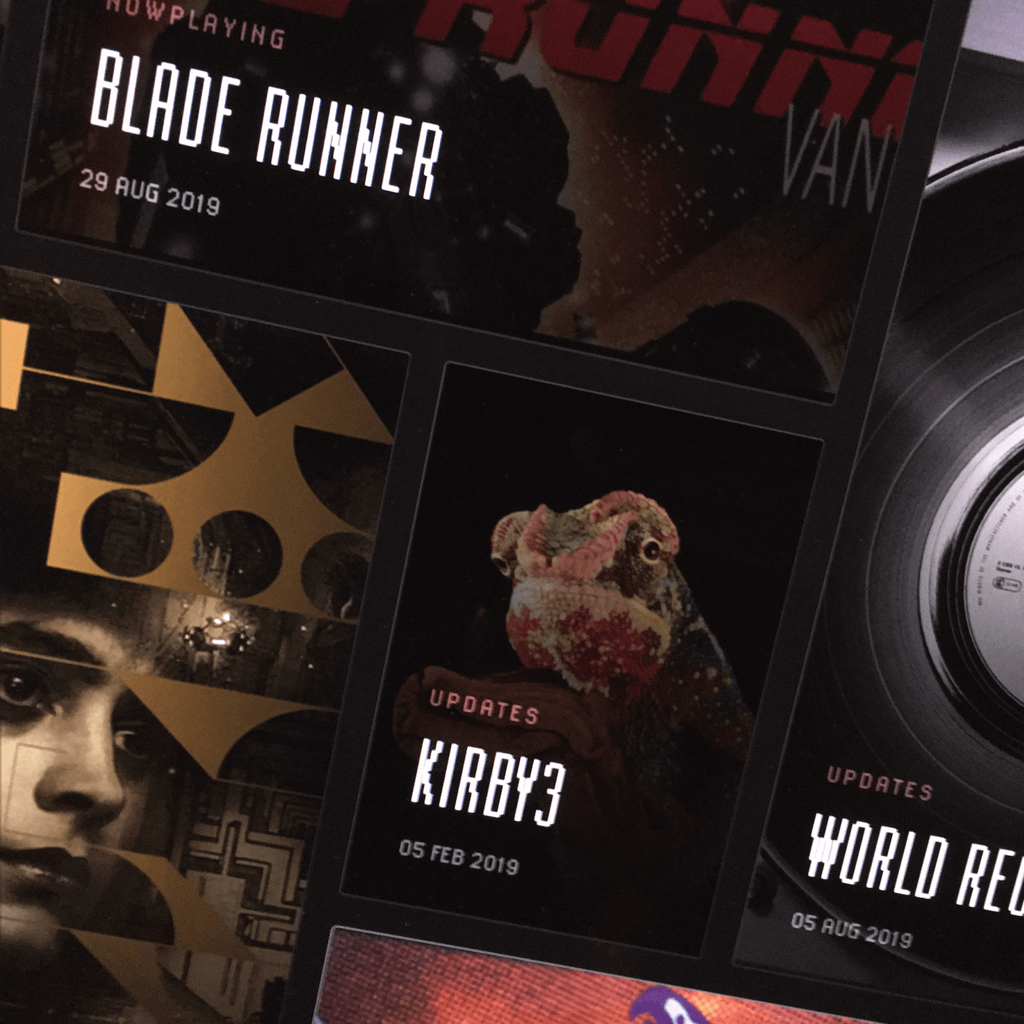
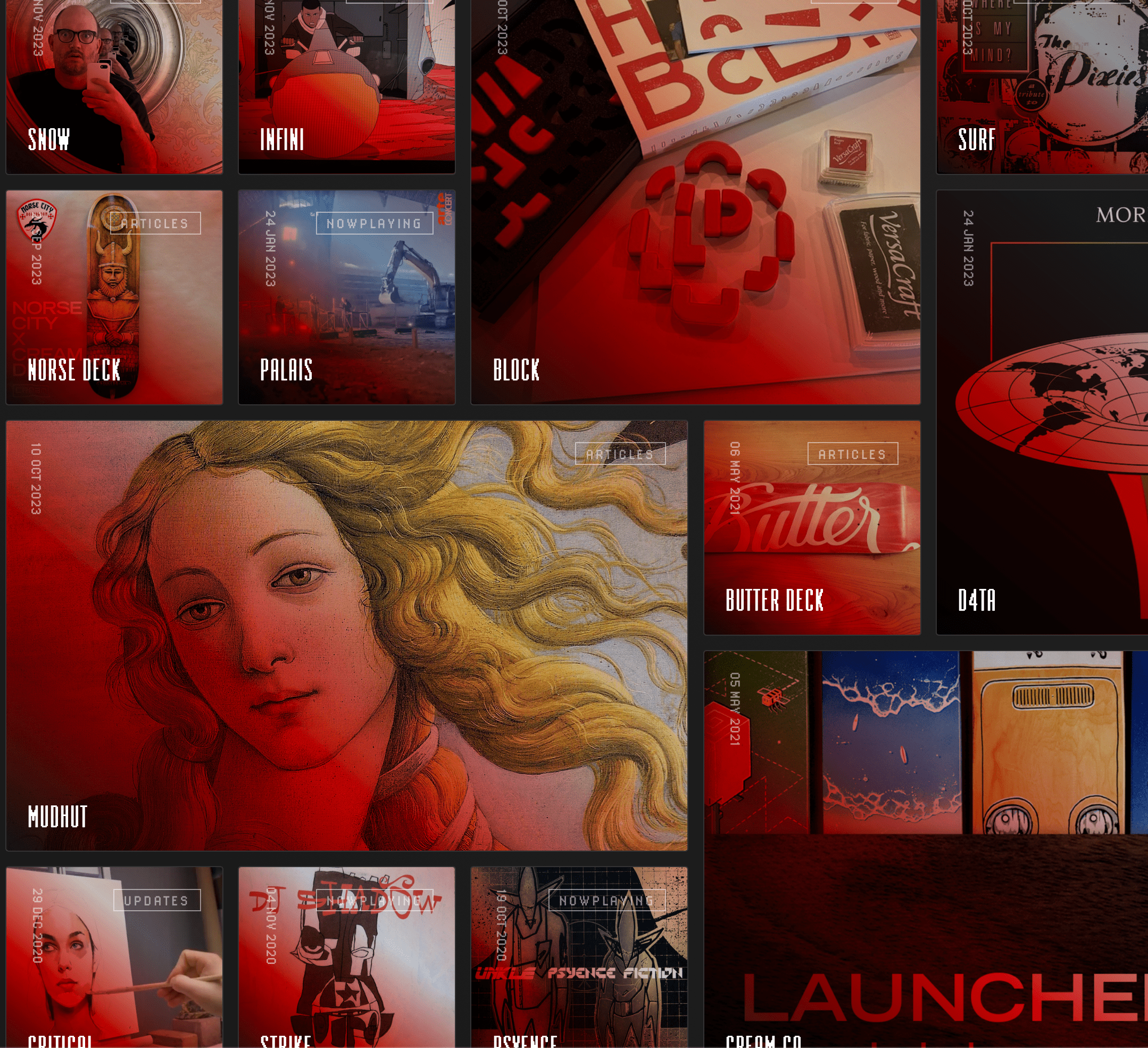
Screens:

homepage design for lukedorny.com v6
The 2020 design was code named Head Unit since it hinted at the design of darkly-coated hi-fi equipment of old. Imagine a Stereo hi-fi that displayed blog posts. What? Utter nonsense.
2020 redesign of LukeDorny's website v6
The complete collection of all of the types of entries rolled into one on the homepage. A grid of each post types, the featured ones larger than others, with a massive and jarring diagonal gradient that wiped your ocular cavities upon hover. NOT a typical design. NOT traditional. …okay, mostly sandbox-y.
2020 redesign of LukeDorny's website v6
The Articles page had a print-related effect, I suppose, that was bleached and monotone until you hovered, and the full color post image smoothly filled in like a polaroid instant photo might. Scratchin’ that itch!
homepage design for lukedorny.com v6
The updates page had a special playing card-style …card …style. As cards. See? Like, right there where the post count number was reversed at the bottom?

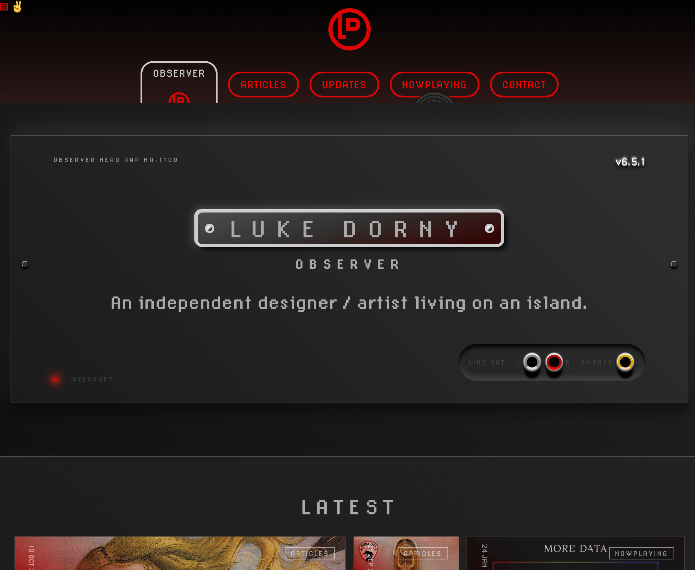
See? author nods at this point while smiling.
2020 redesign of LukeDorny's website v6
Musical posts with proper animations of media according to which version I had… all via strict CSS, no JS.
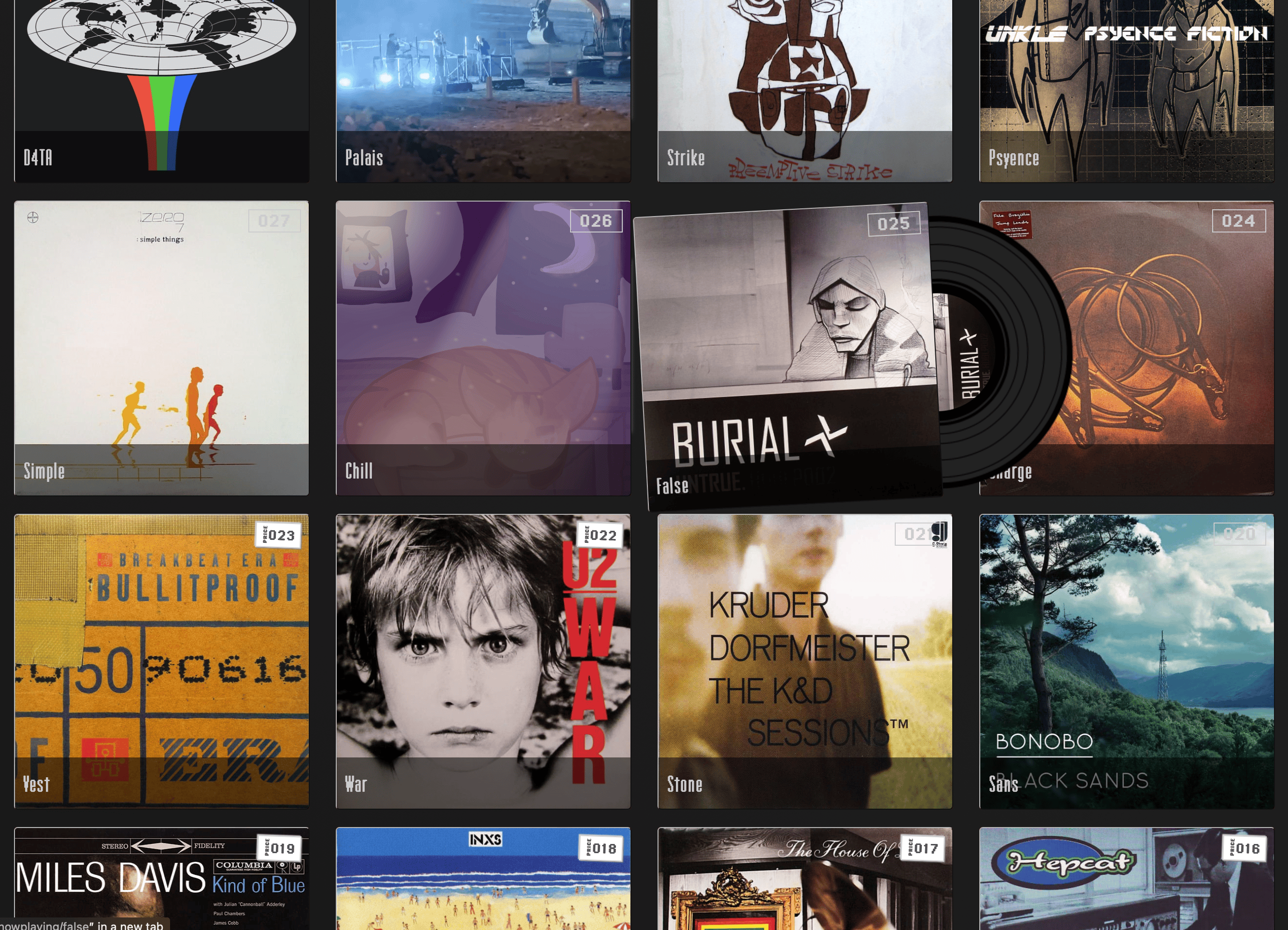
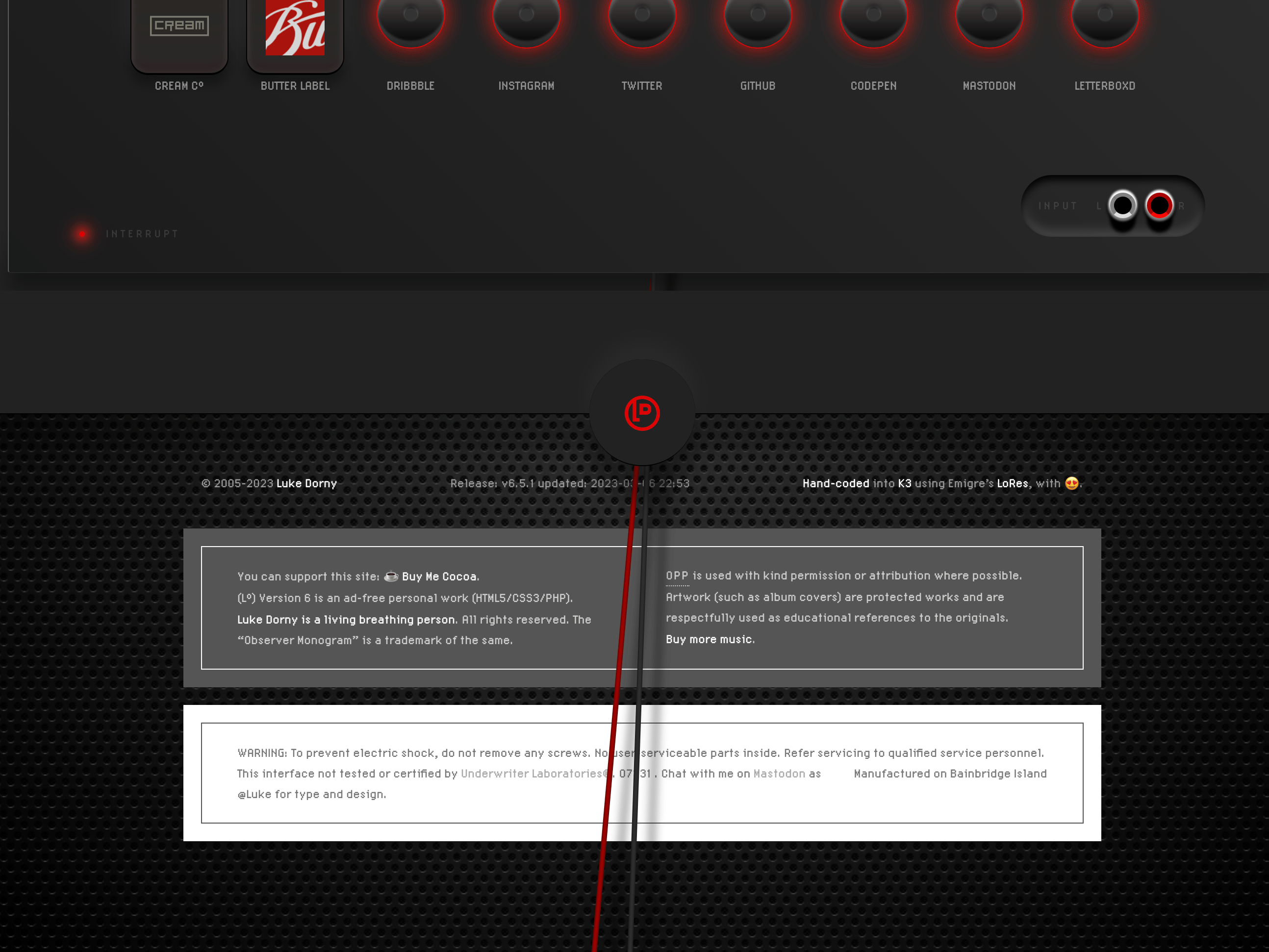
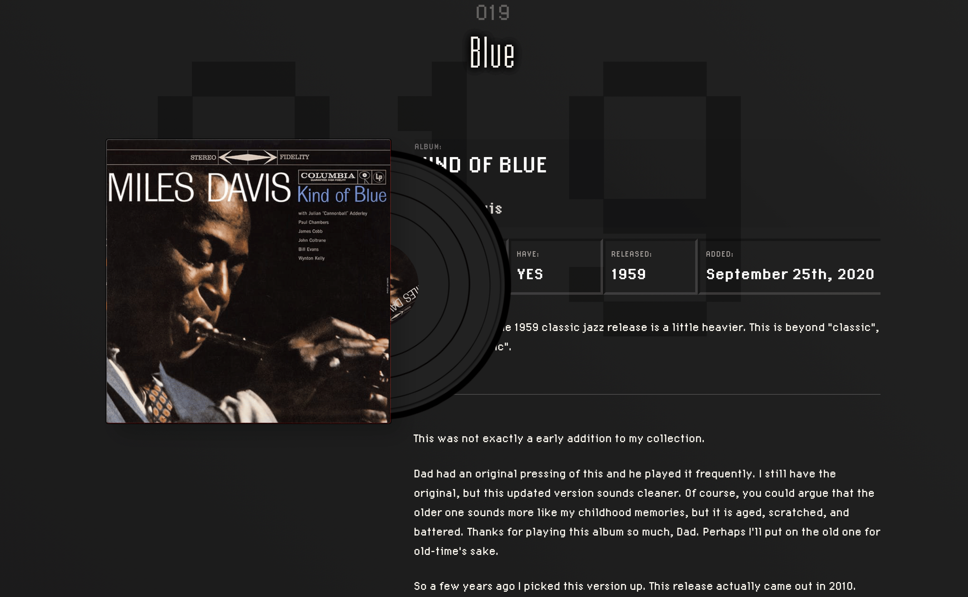
The fact that Reel to Reel, mini cassette, Minidisc, and streaming services (using a floppy disc metaphor!) were included in the variety of mediums made it feel like an odd duck. All to tie in to the spinning vinyl record, of course. By the way, the spinning records sliding out upon hover were entirely made in CSS, there was no image used for the record, beyond inserting the album cover as record center label. Also, if the record I had for the post was colored vinyl, that was created using field entries within Kirby’s blueprints for each post (the engine that I built this site upon). And, the record spun at exactly 33 1/3 speed like a 12” record does in real life. Also, there was a 1 pixel variance in the shape of the record, to give it a 1-2% wobble, mimicking real life.

Who’d do something like this? Me, I suppose. So I’d set about making it.
homepage design for lukedorny.com v6
This footer was wildly odd with exposed positive and negative audio leads spilling out the bottom, casting a shadow on the perforated cooling grill behind. Skeumorphic? You bet.
2020 redesign of LukeDorny's website v6
At the top of each post, a post number and various tidbits were on display, subtly for some of them, blatantly screaming were the others! Here you can see some of the random strings of text used to create the meta lead-in for each post based on time and place, etc. Indulgent to be sure. You can faintly read the “Before heading west” text at the top, which was one of a few Oregon Trail game references.
2020 redesign of LukeDorny's website v6
The bottom of the articles had nothing to do with audio equipment, but I’m still proud of the rough and rudimentary design here.
2020 redesign of LukeDorny's website v6
Each NowPlaying post had a darkly-lit, listening room vibe to it, at least I think so, but with plenty of meta around each release shared, as well as some thoughts of my own to make it personal. It was a satisfying exploration into post-specific design styling that could’ve gone on for a while, but never really broke out of the box as the time passed by, …unrelenting — calling out!

Redesign

With that design under my belt, we’ll clean up some of the old posts that have falling through the cracks and we’ll keep around some of the good ones. Sorry, floor cuttings!

2020 redesign of LukeDorny's website v6
With that, it’s farewell to version 6 of the site, it’s time to move on.

Fare thee well, version 6! We barely knew thee.

Here we go now, into the wild blue! The structure of the new site is nearly complete, and many new parts are being added in, including an entire new section. And RSS!

Naked redesign has begun. This means the site will look horrid but will improve over time as my next theme takes shape. You can track updates I make to the site with my account on Mastodon (the typo.social instance is for type designers, more on that soon).

Like it? You can ☕️ Buy Me Cocoa.

View all 52 Updates 37 Articles 32 NowPlaying Records