Oliver 028
Vaughan Oliver, an album design genius

Mr. Oliver, another art director, a design genius, and an inspiration throughout my career.
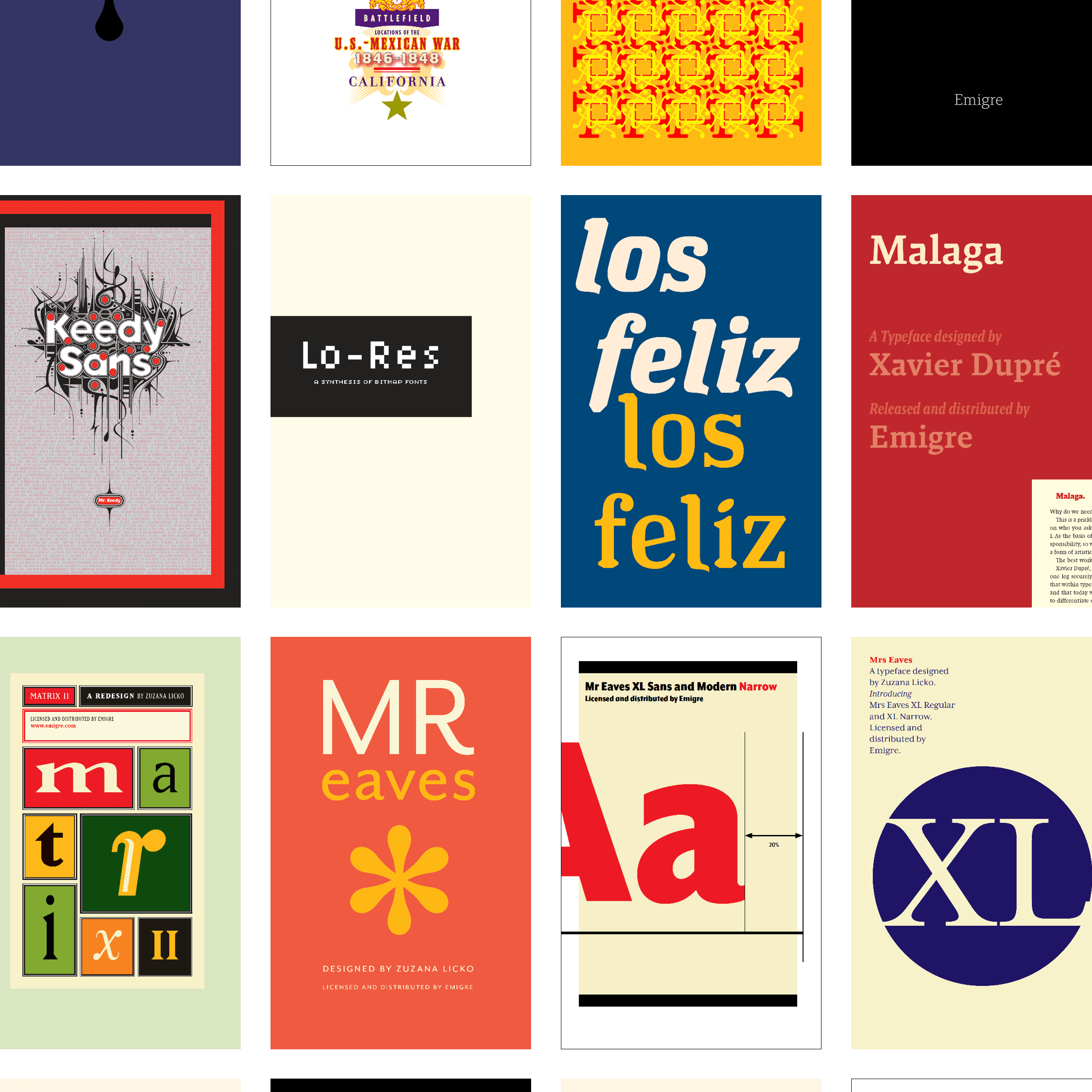
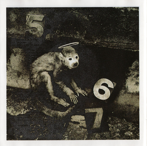
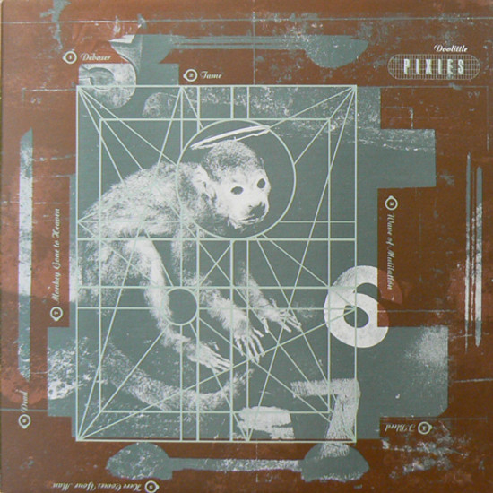
I first saw his work on the Pixies’ Doolittle cover in the late ’80s. Grimy, gritty, dark, and full of visceral visuals, when i looked around at the artwork for other Pixies releases, it was like they had an oddly repulsive attraction. The dark and surreal images that kept me interested in exploring artwork for all of their covers was oddly rewarding (Oliver was included in #9 of Emigre in 1988).
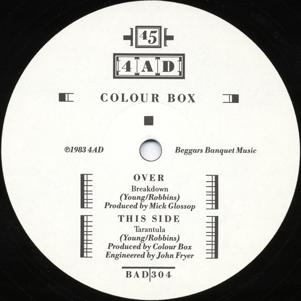
I really loved this exploration. I had to have more.
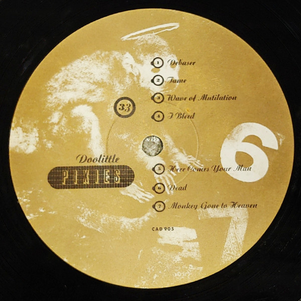
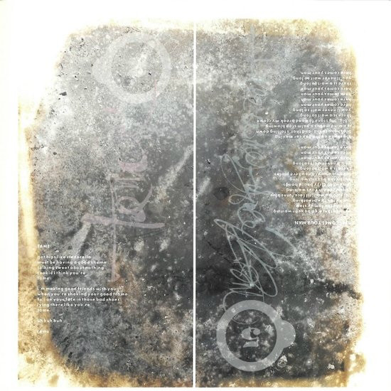
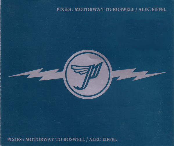
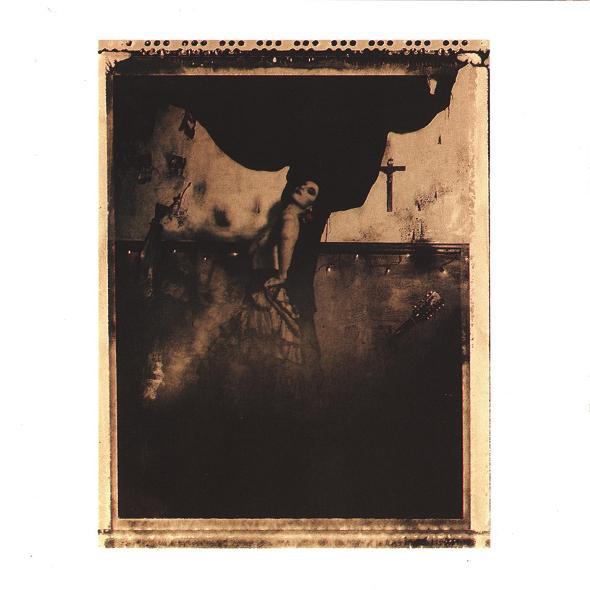
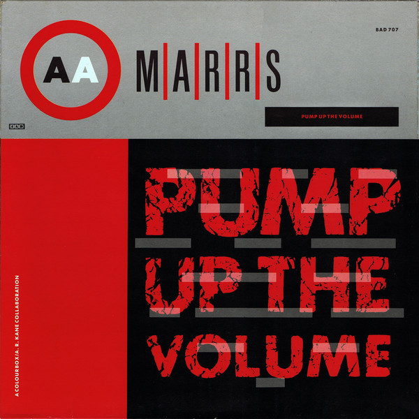
23e v23 4AD
Luckily, Vaughan was quite proliffic with his work and there was much to discover, first with 23 envelope in England, and then running his firm v23. A large amount of the work done for records coming from 4AD were revealing just how consistently talented he could be. With more than 300 releases on Discogs credited to his name, he was proliffic indeed.
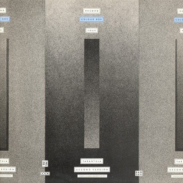
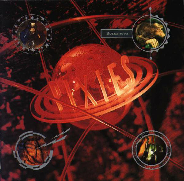
Thank you, Mr. Oliver.
Update
While reading about Vaughan, I learned that he designed every release for the entire discography for the Pixies, up until a month ago when he passed away.
Like it? You can ☕️ Buy Me Cocoa.
 Luke Dorny