Interlocker 044
Scribbled by your hero
 Luke Dorny
without regard to the other articles on
before heading west.
Luke Dorny
without regard to the other articles on
before heading west.
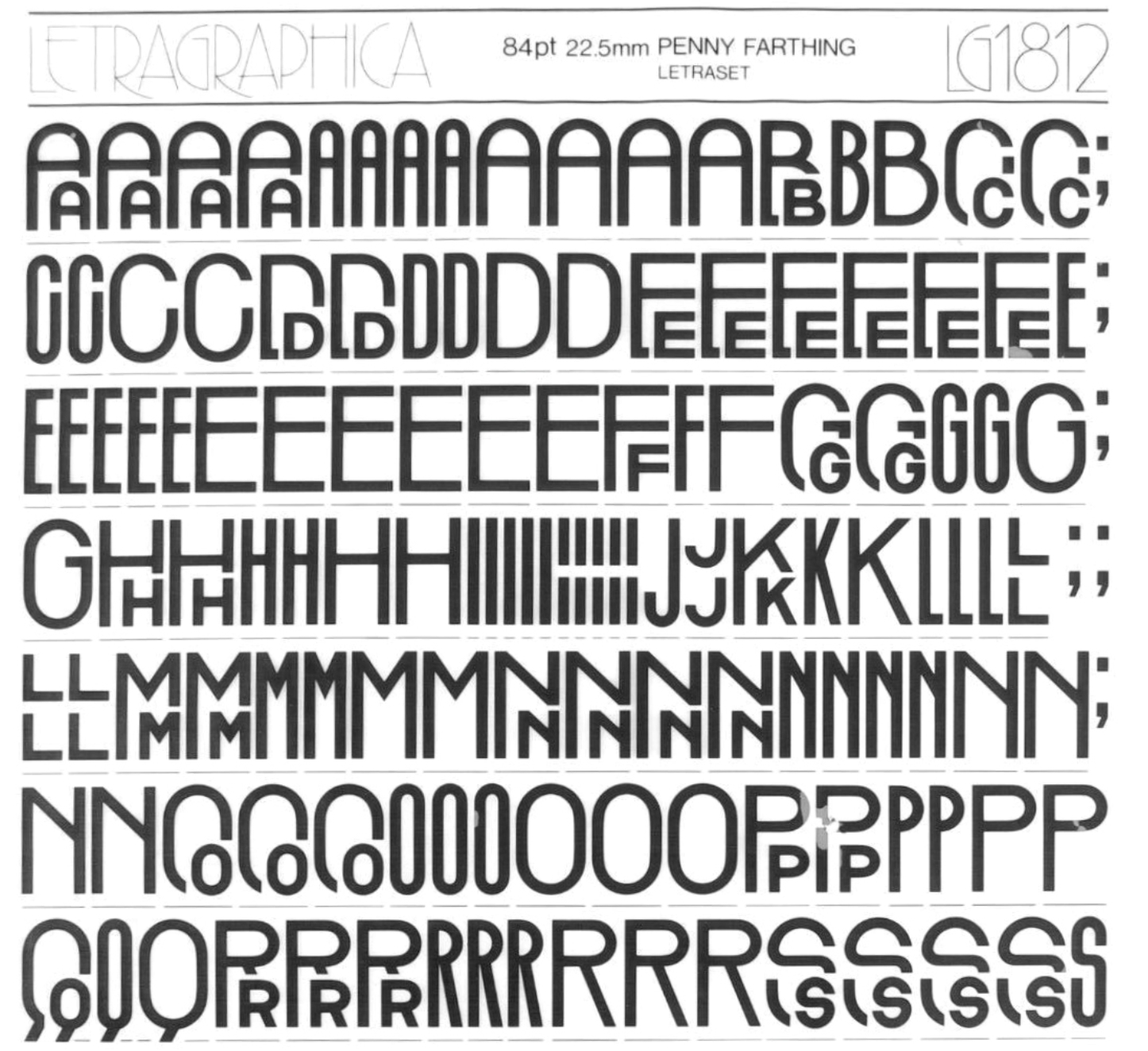
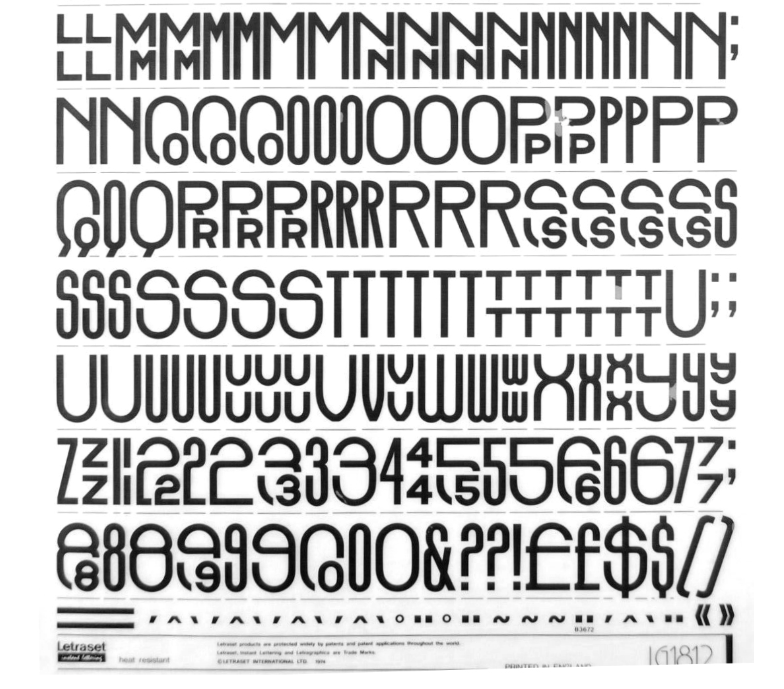
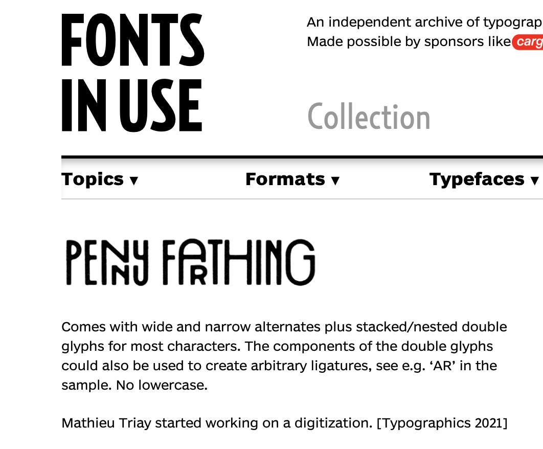
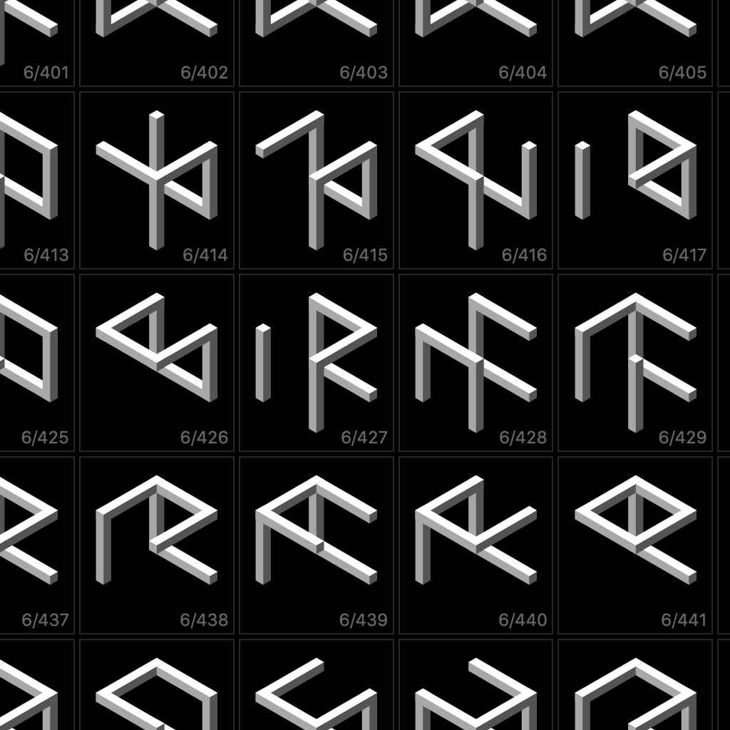
According to the fantastic Fonts In Use site, Bob Newman designed several varied styles of typefaces during the 1970s that were published on Letraset and Linotype.
This one is tops: Penny Farthing… with an incredible use of intersecting glyphs creating an Avant Garde style play between letters that is quite exceptional.
More info on Bob Newman Fonts In Use site: https://fontsinuse.com/type_designers/438/bob-newman. Thanks to Florian Hardwig on the site for linking to the image of the Letraset sheet used for this post.
Like it? You can ☕️ Buy Me Cocoa.
- « Critical
- Don't stop there!
- Block »